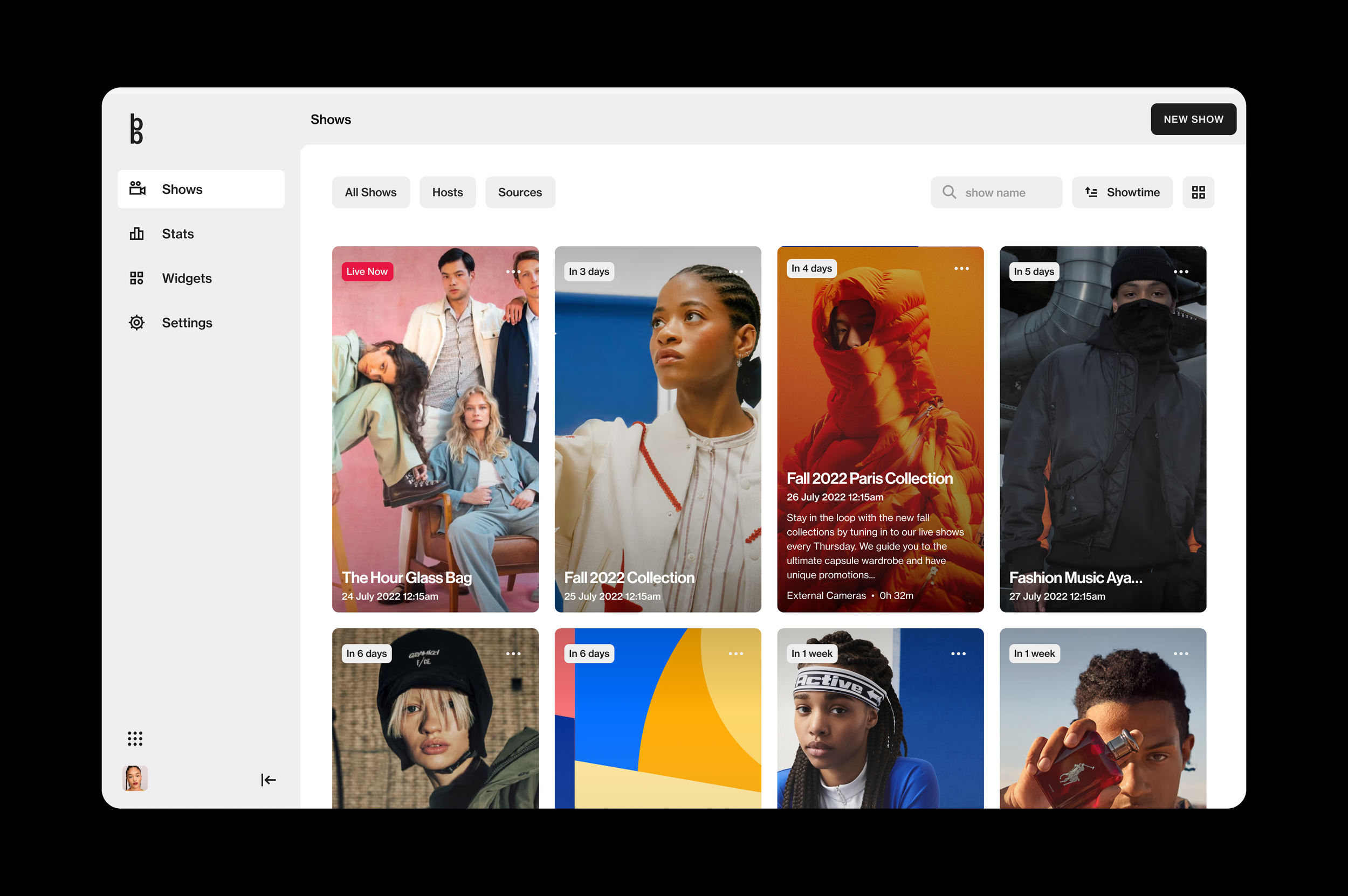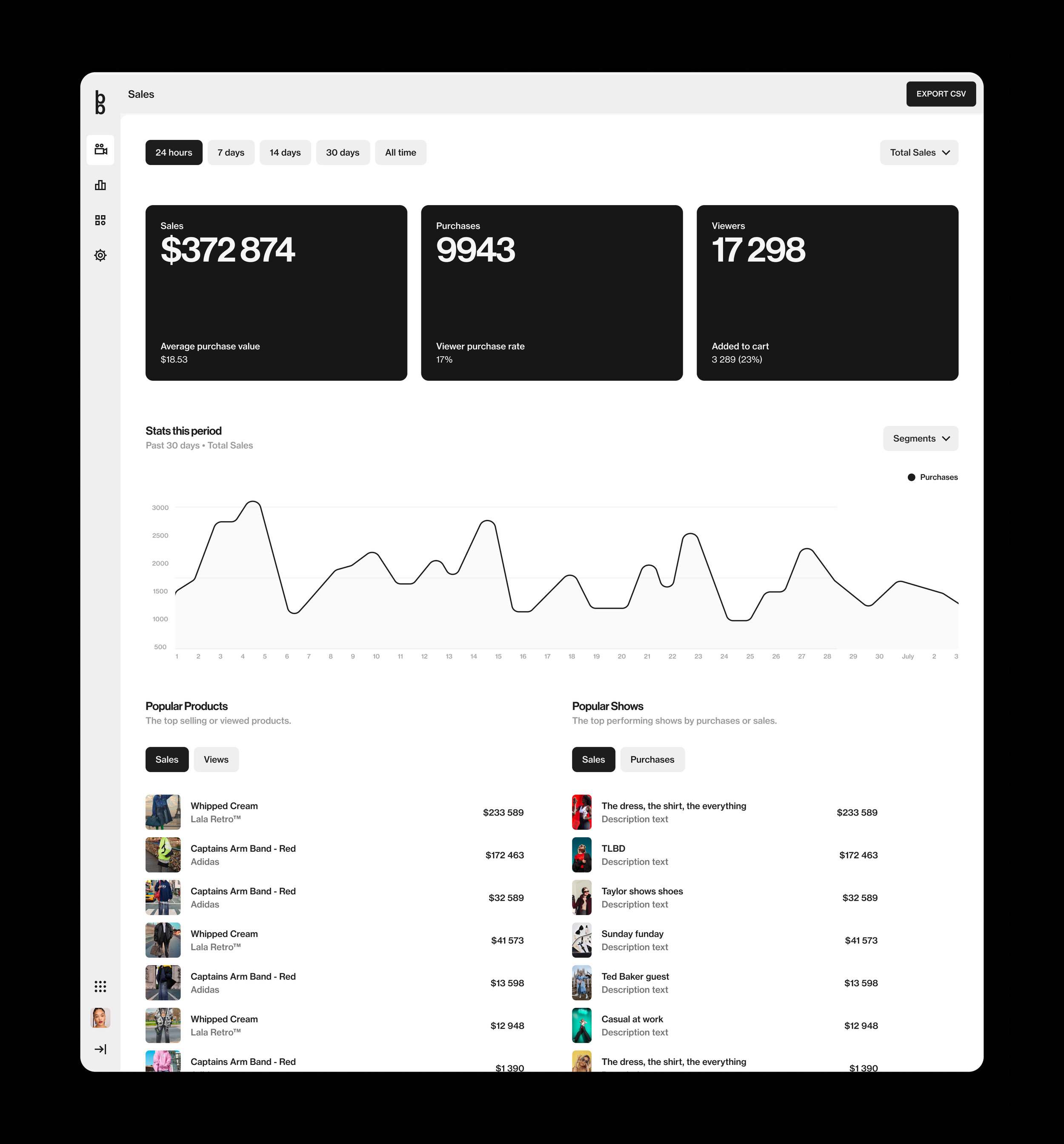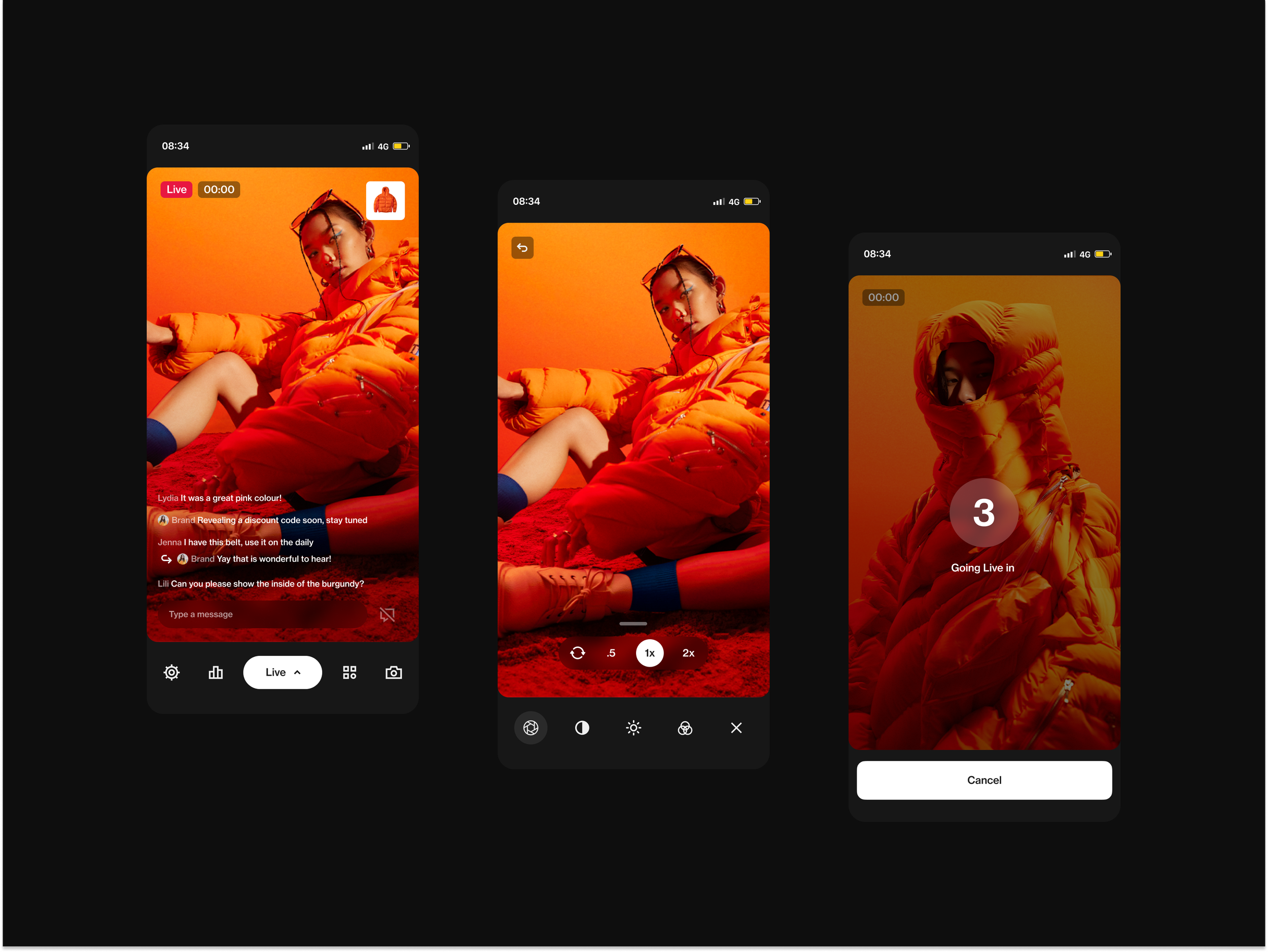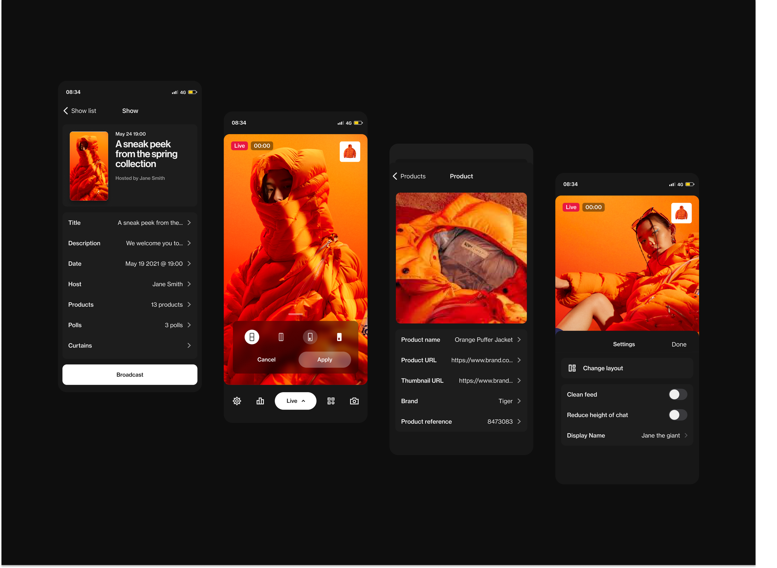
Bambuser
To support their growing customer base, the #1 live video shopping platform needed a major product rehaul. Overtime it also became clear that a common design language was needed to unify the teams and strengthen brand cohesion among the different products.
The Process
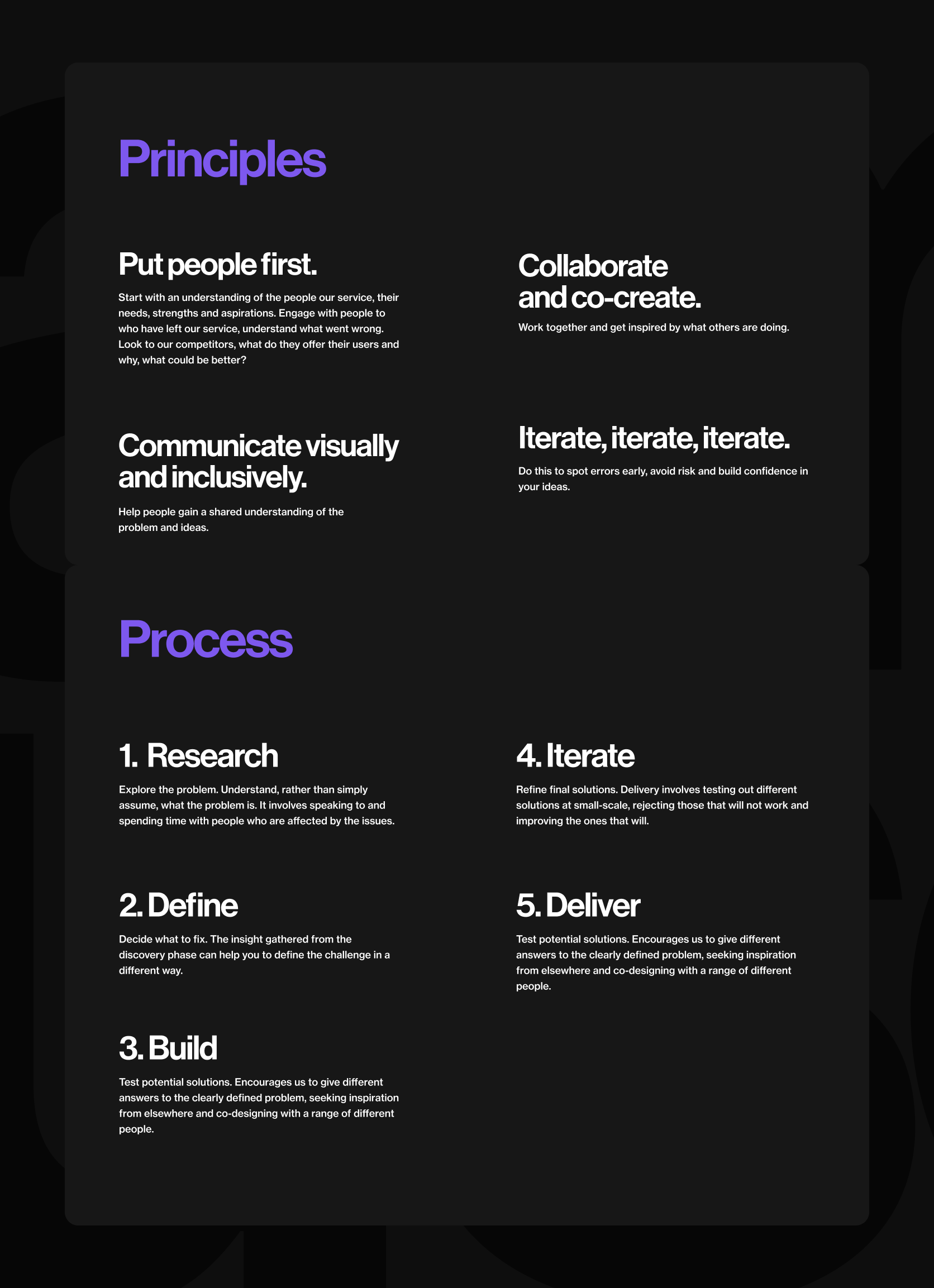
As a senior product designer on the team, one of my challenges was to define a way of working that wouldn’t interfere with the current workflow of the company but still manage to get consistent quality work out the door. As most things product, the user had be at the center of (almost) every design decision. To be successful as a team we needed to work collaboratively, transparently and iteratively.
Research
〰️
Define
〰️
Build
〰️
Iterate
〰️
Deliver
〰️
Research 〰️ Define 〰️ Build 〰️ Iterate 〰️ Deliver 〰️

The Research
Over my 2+ years consulting at Bambuser, research took on many forms and touched on several areas of the product. But to gain an understanding of what a typical research sprint would look like, I’ll highlight a session we had during the Live Show redesign.
Bambuser already had an impressive customer base, so our work was cut out for us. The first step was to identify our most active customers based on how many shows they produced and how many viewers they would bring into these shows.
After targeting our most active customers we conducted interviews with as many as possible.
Then we extensively documented each interview, creating persona cards for each participant. These summed up facts, insights and opportunities gathered during the interviews.

At this point it was easy to discover and cluster common trends and patterns among the participants that we could then later analyze and target pain points and hidden opportunities.
Interviewing our customers not only provided us with invaluable data that we could later use to validate design decisions. It also humanized our relationship with our customers. We gained a much deeper understanding of their frustrations, confusions and also their happy moments.
It's good to note that this process happened many times over the course of the project. By no means was this a linear process.
Alongside these interviews there was also a constant flow of market research, competitor analysis and journey mapping. But by and large, actually talking with our users made the most meaningful impact.

Wireframing & Prototypes
Research, ideating and testing, are constantly rolling over each other for a chance in the limelight. Product design is never linear. If it is, then we’re doing it wrong. That being said, while research and testing are doing the heavy lifting, ideating and building, for me, are the rewarding fruits of our labor.
At Bambuser, there certainly was no shortage in this department, and sometimes are prototypes got a little out of hand…

Brain storming, wireframing and prototyping was our daily meat and potatoes.

As we worked in small collaborative teams, we tracked almost everything in Asana while Figma was our design weapon of choice. Most pixels were preceded by a couple brainstorming sessions that usually let into user stories (I’m a huge fan), followed by active discussions throughout the wire-framing and prototyping stages. It became so elemental to our process that we could dish out a handful of test ready interactive variants in a day, test them, reiterate and see them in our browser before lunch the next day.

Design System & Tokens
During my time at Bambuser, we often struggled to maintain consists across products and often times there was a lot of extra work involved after handing off to the developers. This required a rethink of how we worked. I identified 3 main problems that could be improved in this area.
Problem 1
Bambuser has several complex enterprise products that are designed and built for the most part silod from each other. As a result, we now have a set of apps that continue to grow further apart in language, visual cohesion and code unity.
Problem 2
Designers are often struggling to maintain structure and cohesiveness in our files. Stakeholders do not know where to look for the latest and greatest. Design files are loaded with inconsistencies and ad hoc decisions that ultimately make their way to production.
Problem 3
Since our teams have been working independently for some time, there are issues with API cohesiveness across products and features. This also contributes to unnecessary developer/designer friction.
Solution
I proposed to include a handful of multi-platform design practices into our workflow.
Shared Definitions and API cohesion. Naming conventions and documentation should try to remain consistent across all platforms and products.
Visual Cohesion by implementing design tokens and reusable components.
Consistent practices within our design environment. Including standardising how we work and iterate on new features, spec and handoff to our developers and visually communicate to our stakeholders.
Practice parallel design and coding. And monthly clean up sessions where developers and designers are involved.
Takeaway
The incohesion in our products, from design to development, mades our brand feel disjointed, puzzled our customers and often frustrated our creators and stakeholders. To break down these barriers, we needed a set of guidelines that would unify our products, make it easier to build and make decisions and ultimately create autonomy for us creators and provide a delightful experience for our customers.

Visual Design
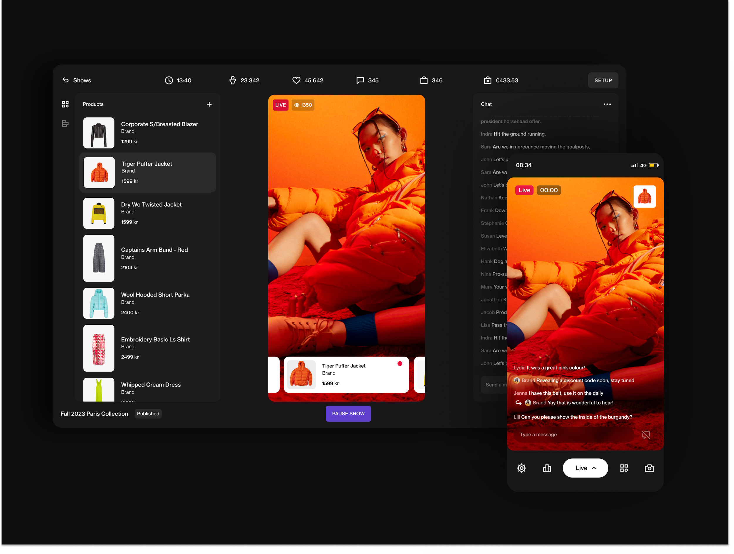
After having our design hypothesis validated and development most likely underway, this was the chance to make all of our hard work look and feel fabulous. Thanks to our powerful and flexible design system, most of our wireframes actually looked pretty darn good out of the box. So this stage was all about the tiny pleasant bits. Getting animations and transitions just right, cleaning up all the minor flaws, and focusing on micro interactions. Basically, this is where we bring joy to the experience.
